
Case study
Kiosk Application for presenting the company
Time range
Jul 2024 – Sep 2024
Time for reading
~ 8 min
Tags
UX/UI, new project, kiosk
This task was a part of a bigger project — preparation for the 2024 International Broadcast Convention (IBC) for createctrl. The primary purpose of this application was to be showcased on a 32-inch kiosk at CreateCtrl’s booth during the IBC event, to serve as a natural conversation starter for representatives.
Context
The stakeholder
The owner of this project is createctrl — company which have been developing IT solutions for Television, Radio & Streaming.
The goal
Development of a kiosk application, that would be showcasing the WebSuite Apps during the event, with the goal to re-use the application in future event edition.
Timeline issues
We received all three tasks, along with several smaller ones, in mid-July, leaving us approximately two months to develop the entire subbrand. To meet the deadline, we worked on all projects simultaneously, prioritizing those requiring development time. Despite these constraints, all IBC-related projects were successfully delivered on time.
Development team
3 PMs, 2 UI/UX designers, 1 frontend developer.

All materials, designs, and insights presented in this case study are the property of createctrl. This work is shared for portfolio purposes only, with the sole intent of demonstrating my role and contributions to the project. No unauthorized use, reproduction, or distribution is permitted.
The outcome
Altough the very tight deadline, we were able to deliver the whole project on time. The COO’s announcement that all projects from the 2024 event, including the kiosk app, would be reused for future editions. Post-IBC results showed nearly 40% more sign-ups compared to previous years, marking a significant success for CreateCtrl.
Design process
Design process
Research
This was a completely new application, as no similar app existed within createctrl before. Although the company had participated in previous IBC events, there was no specific style guide for this event, resulting in a blend of WebSuite and createctrl design elements.
To start, I searched for examples of presentation apps but found none. Instead, I put myself in the shoes of potential customers, imagining what I would expect to see at the booth. Using this perspective, I created sketches and drafts exploring possible directions. After meeting with stakeholders, we selected a clear approach for the project.
Design change process
The timeline for creating this app was very tight, requiring us to begin work immediately to allow sufficient time for development. The main challenges were designing a style that suited all apps and planning an information architecture tailored for a tablet interface.
To meet the deadline, we conducted research and ideation ad hoc, immediately translating insights into wireframes. This streamlined approach allowed us to move faster through the process.
Wireframes
To highlight key features, we created multiple wireframes. Defining the global structure was challenging — we explored options like slide presentations and scrollable components.
Ultimately, we considered the event setting: a loud, crowded space with limited time for reading. Based on this, we opted for a tabbed layout, allowing each application to be showcased clearly and efficiently.

Sketches/LoFi wireframes of the app.
Navigation
We needed to determine the user navigation, focusing exclusively on the kiosk’s strengths and limitations since the app was designed solely for this device. Considering its use at a bustling trade fair, with noise and time constraints, we opted for a simple left-bar navigation.
The main page was accessed via the CreateCtrl logo, while app logos linked directly to their respective pages. It allowed users to easily go through each app.

Wireframe pf navigation for product pages.

Wireframe of navigation for main page.
Main page
The main page functioned as both a homepage and an introduction to our products. It showcased our core qualities, background, and a brief overview of offerings. At the top, we emphasized key information and qualities.
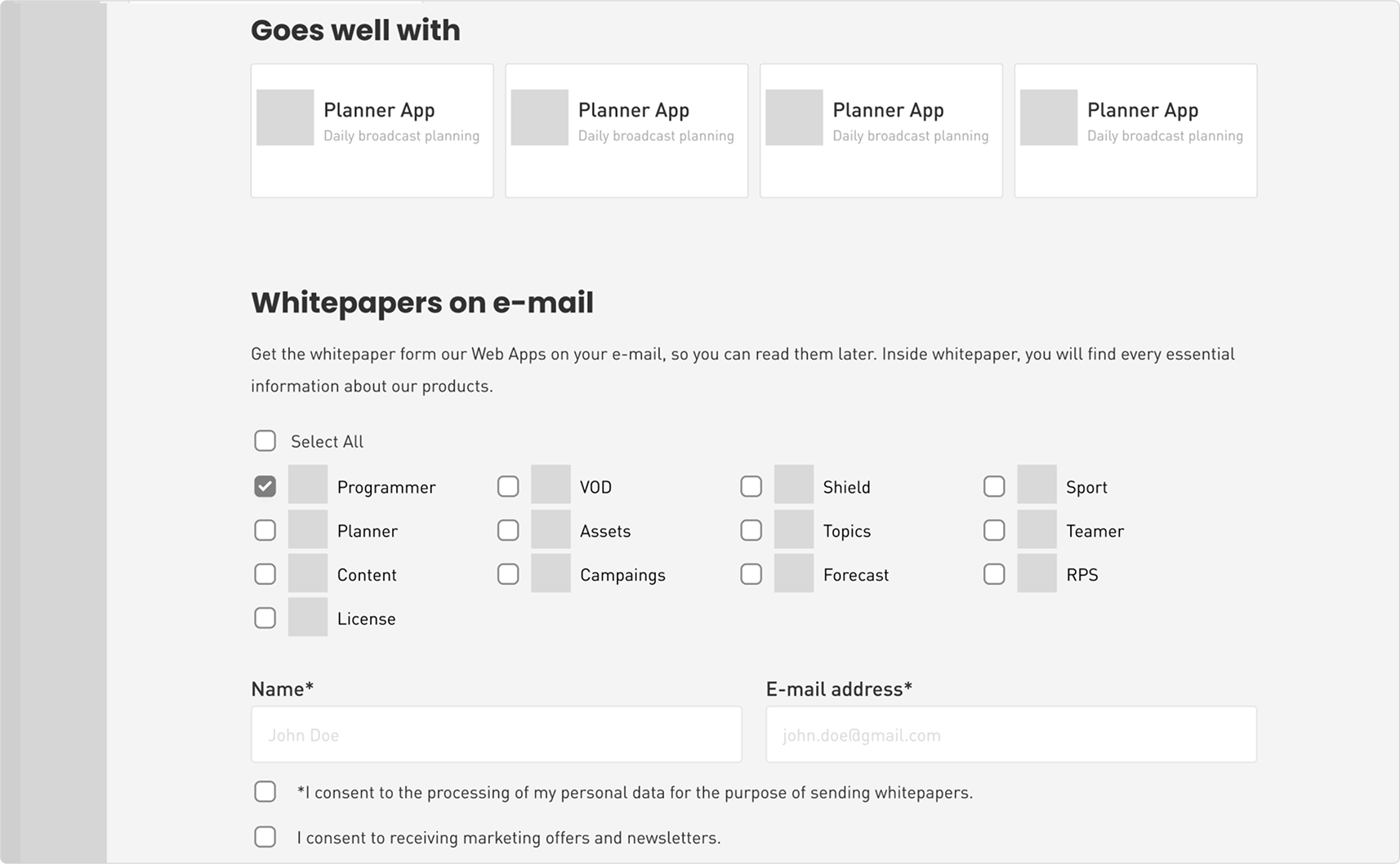
It was followed by tiles linking to individual WebApps an the "life of content," a brief overview of how our apps are utilized. The page concluded with component “Whitepapers on e-mail”, which provides the option to sent a whitepaper of selected app to visitors e-mail.

Wireframe of the main page; the header

Wireframe of the main page; the presentation of WebApps

Wireframe of the main page; the life of content.
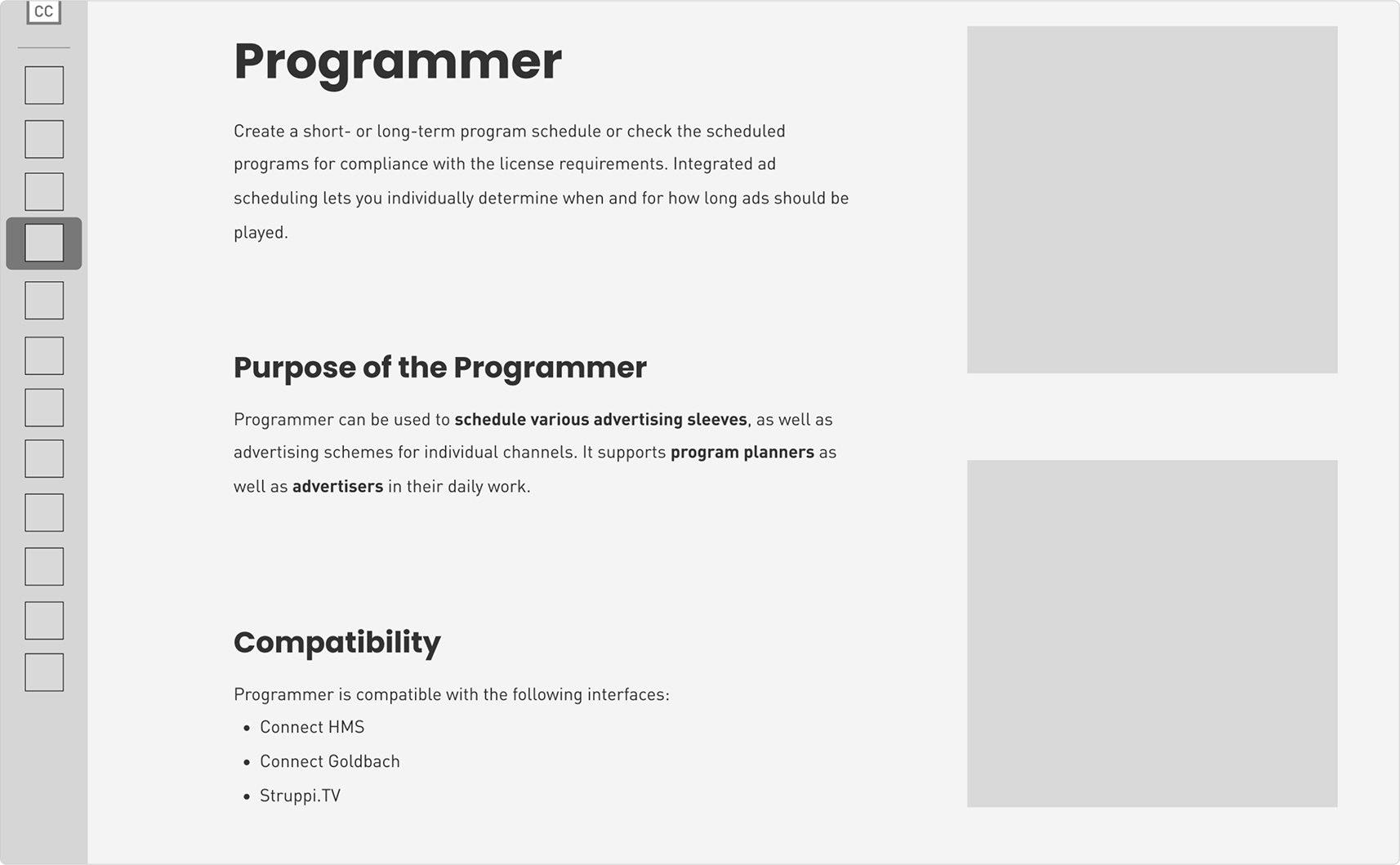
Product page template
Initially, we planned to use a single-page template for each app, similar to the main page. However, some apps had too many features to fit on this view. In this case, we divided the content into three tabs: an app overview, features, and “Goes well with”.
Each page concluded with a "Whitepapers on Email" component, allowing visitors to request app whitepapers or subscribe to the newsletter.
Declined wireframe of one page idea; the header.
Declined wireframe of one page idea; features.
Declined wireframe of one page idea; the "goes well with" section.
Selected wireframe of the product page; the overview tab.
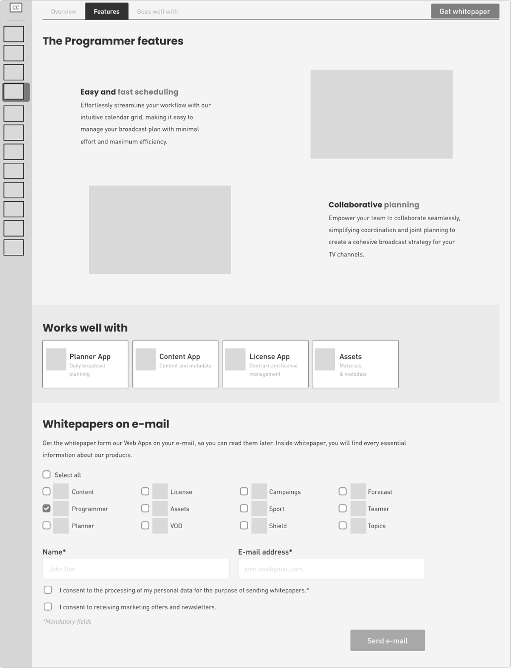
Selected wireframe of the product page; features tab.
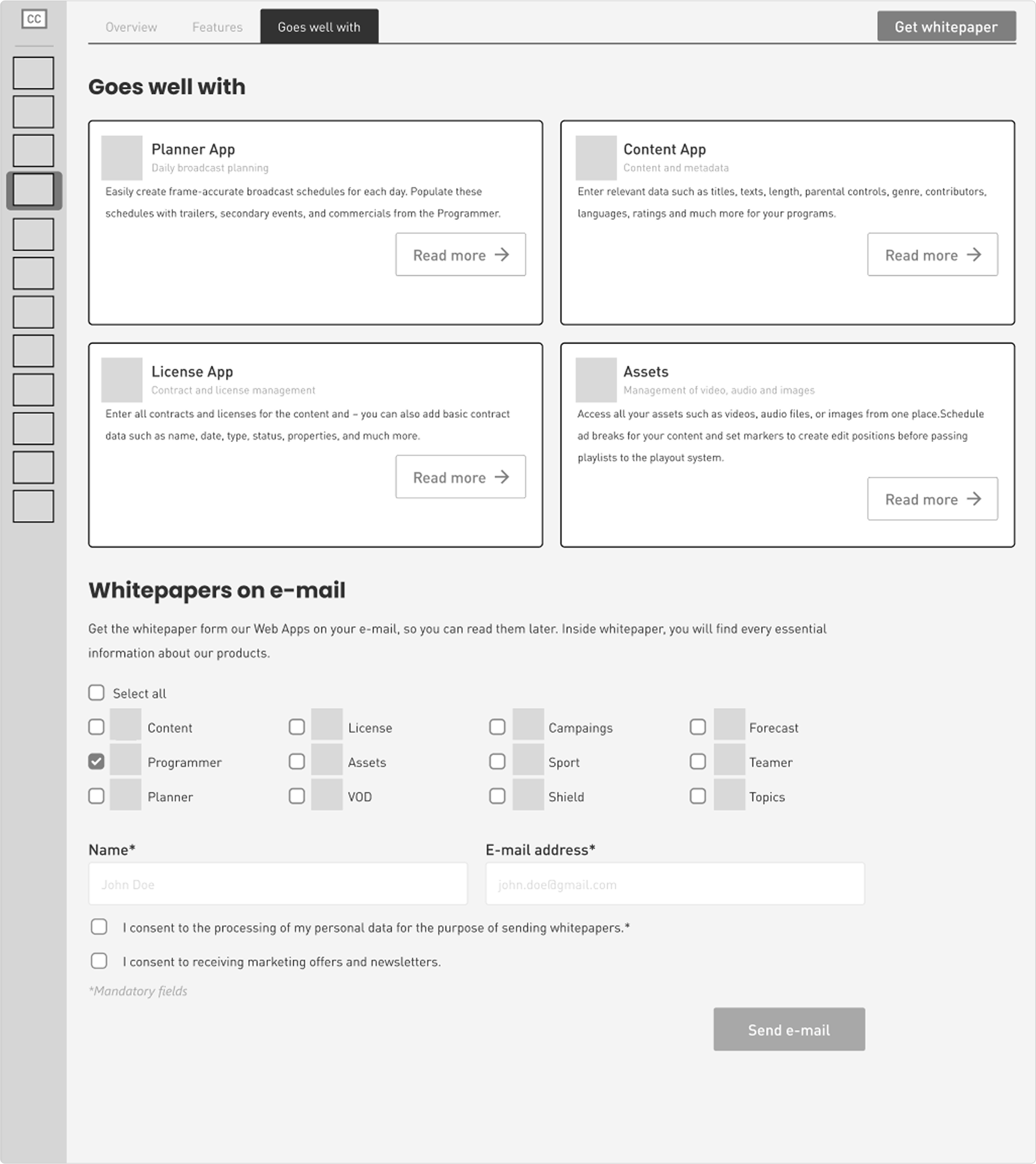
Selected wireframe of the product page; the "goes well with" tab.
Design system
As there was no existing design system for this project or previous IBC editions, we had to create one from scratch. Together with Paulina, the supporting designer, we developed the foundation of an exclusive style guide for CreateCtrl's trade fair materials.
Using CreateCtrl’s primary colors, we established visuals, decorative elements, and incorporated the main colors of the WebApp system. This resulted in a cohesive, reusable design system for the WebApp Presentation App.

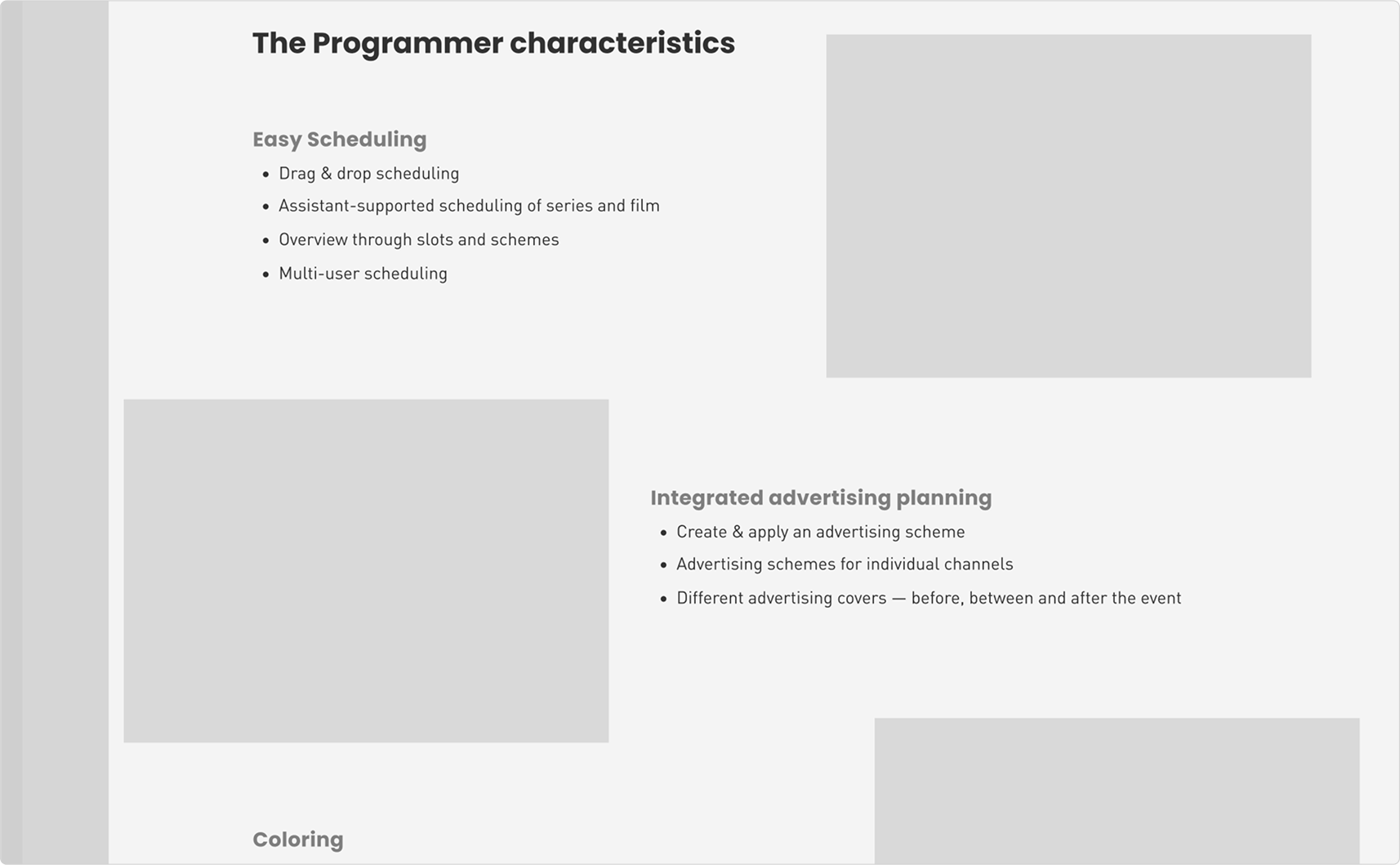
Example of boards in design system; typography.

Example of boards in design system; buttons.

Example of boards in design system; Apps tiles.

Example of boards in design system; colors.

Example of boards in design system; Menu.
Overlay
We also prepared an overlay for when the kiosk was not in use. To save time, we repurposed a presentation Paulina had created for the booth's TVs, adapting it into an overlay with an infographic prompting users to touch the screen.

Preview of the overlay on tablet; in background — part of the presentation video.
Copywriting & images
The app's text content was written by me, the Product Owner (PO), or the stakeholder. Most images were provided by the PO, with minor adjustments made by the design team.
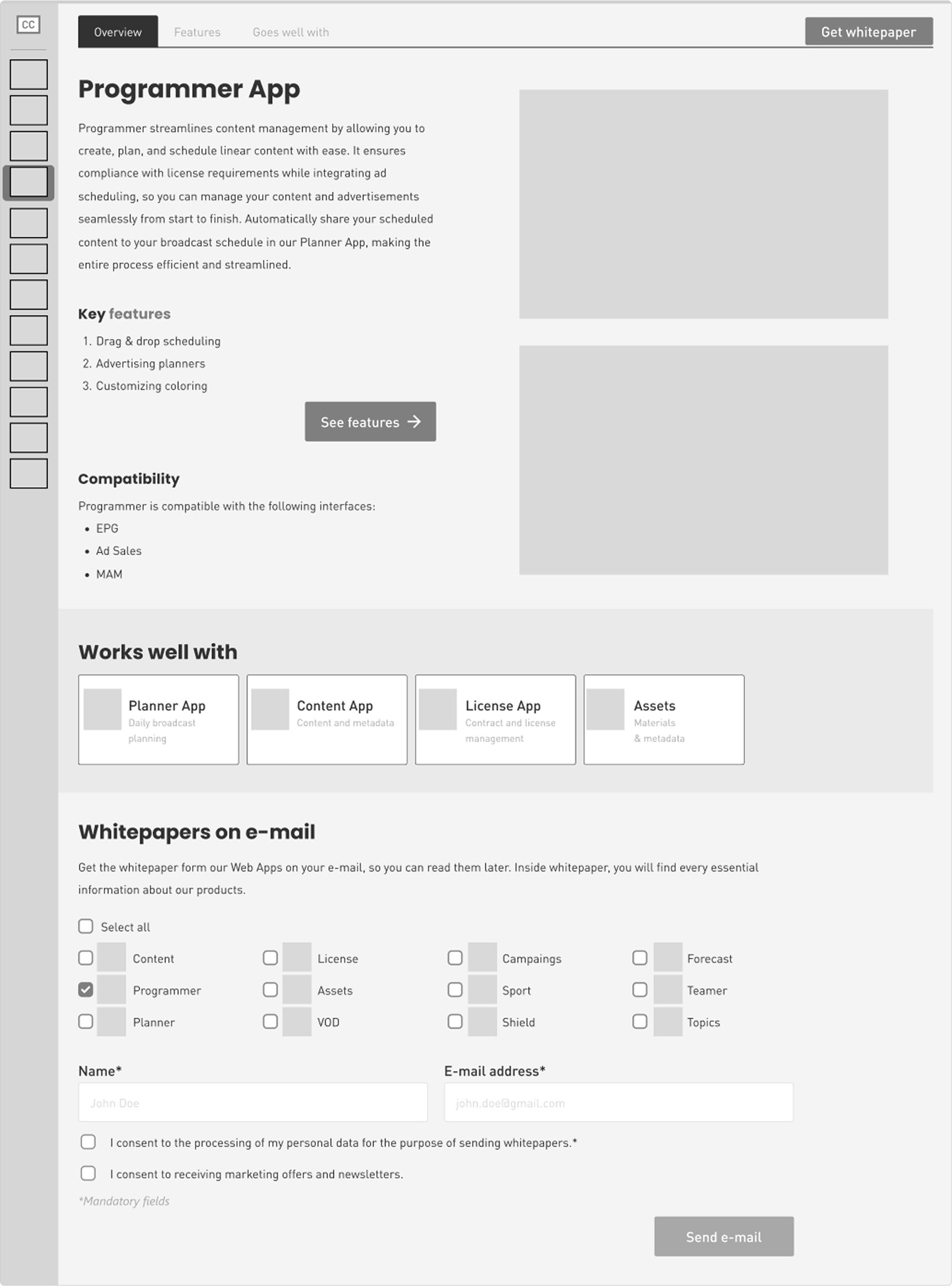
Final product
The final mockups included the homepage and all product pages. For this case study, I will showcase three example product pages, as they share the same template but differ in images, text, and primary color.
Final mockup of the main page.

Preview of the final mockups of the SportApp; the overview.

Preview of the final mockups of the SportApp; features.

Preview of the final mockups of the SportApp; "goes well with" tab.

Mockups of the Programmer App.

Mockups of the Content App.

Mockups of the License App.
Summary
Despite the tight deadline, we successfully delivered the project. It served its purpose as a catalyst for discussions.
Booth employees confirmed it was an excellent conversation starter, helping initiate discussions with visitors frequently. Post-IBC results showed nearly 40% more sign-ups compared to previous years, marking a significant success for CreateCtrl. Two months later, after analyzing all data, the COO announced that all projects created for the 2024 IBC, including the Tablet App, would be reused in future IBC editions.

Photos made by one of the employees of createctrl on the booth.
Check other case studies

Case study about a hobbyist gecko store, where I was given full creative freedom.

Showcase presenting the process of transitioning the cinema hall creator from an old desktop application to a web version.
Learn more about my experience, background and approach to design.
Let’s connect and explore the possibilities on how we can work together.