
Case study
OnkoApp — mobile app for oncology patients
Time range
Sep 2021 – Mar 2022
Time for reading
~ 15 min
Tags
UX/UI, mobile
This Bachelor's project focuses on designing an app to support oncology patientson their healing journey. It was my first project completed independently, created specifically for the Polish market, with focus groups based in Poland and some content provided in Polish.
My thesis received the highest grade and was awarded with distinction. According to my lecturer, it is now being used as an example of work for studients as for 2023.
Context
Behind the project
For my Bachelor's project, I aimed to create an app to help oncology patients transition more smoothly into their new reality. The oncology treatment journey is often challenging, with many patients feeling unsupported by doctors or foundations.
Problem statement
The lack of clear information can push patients toward online research, exposing them to harmful "golden cures" and false unconventional treatment advertisements.
The goal
Design a mobile app to support cancer patients in managing their treatment, storing essential data, and finding help during their most challenging moments.

After several years
Looking back at this project, I see many things I would approach differently — such as the UI design and the personas.
While it's not perfect, I value it greatly as a turning point in my career. It taught me valuable lessons, allowed me to validate my ideas, and marked a milestone in my learning journey. Despite its imperfections, it remains essential in showcasing my growth and experience.
The outcome

I conducted real-data research, learned to prioritize tasks, and refined my approach before working on a live project. While I see areas I would now approach differently, this remains one of the most challenging and knowledge-expanding projects in my portfolio.

Discovery
Discovery
Competitive Analysis & Benchmarking
OnkoApp was envisioned as a comprehensive platform where patients could organize their treatment effectively. Finding direct competition was challenging, as no existing application fully covered OnkoApp's objectives. General medical apps often failed to align with the app's specific goals, so the research was expanded to include apps that partially met the criteria.
The analysis focused on aspects such as visual design, functionality, content, user feedback, accessibility, and inclusiveness. While I reviewed numerous mobile applications, I conducted an in-depth analysis of seven selected apps, categorized as follows:
Access to medical knowledge: Onkoteka (PL), CanCell Cancer
Medical apps: My Heart, mySugr, MojeZdrowie24 (PL)
Communication with others: Pacjenci Pacjentom (PL)
Oncology treatment tools: ChemoWave
I documented the strengths of each app, which informed the initial concept of OnkoApp. This research provided valuable insights into features worth integrating to create a truly helpful tool for patients.

Preview of screenshot of the apps I have researched — Onkoteka, CanCell Cancer, My Heart, mySugr, MojeZdrowie24, Pacjenci Pacjentom, Chemo Wave.

Preview of comparison table for selected apps.
Questionnaire survey
Analyzing existing applications provided valuable insights into potential features, important considerations, and aspects I hadn't previously thought of. After summarizing these analyses, I identified functionalities to evaluate for their suitability with future users. To test these ideas, I created a questionnaire using Google Forms.
I recruited participants through Facebook support groups, which are often restricted to those with direct experience in cancer treatment. Despite limited access, I gathered 46 responses, with 36 from current or former oncology patients. Among the respondents, 95% were women, and 37% were aged 45–54.

Preview of some of the questions from the survey.
Questionnaire summit
The survey responses, collected over a month, revealed several key insights:
Knowledge is crucial: All respondents actively sought to expand their knowledge, often through books about oncology treatment. Additionally, 75% felt that cancer is overly demonized.
Mental health matters: Every participant made efforts to maintain their mental health, with 70% focusing on continuing a normal life and avoiding fixation on their illness.
Caution in trust: Respondents were highly aware of exploitation targeting oncology patients for profit.
Limited trust in doctors: Nearly 90% admitted having trust issues with doctors, and 60% expressed a definitive lack of trust. While 51% believed chemotherapy to be effective, 75% preferred a holistic approach to their healing journey.
Online research remains prevalent: Many participants relied on the internet, particularly Facebook support groups, for treatment information.
Support is essential: 75% received support during their treatment, and over 30% reported not feeling abandoned after their diagnosis.
In-Depth interviews
I worked alone, so I recorded each session (with participants' consent) to focus fully on the discussions. The interviews were conducted via Google Meet, with Miro as the platform for interactive tasks. Along with small talk and a warm-up activity, participants engaged in two main tasks: 5x Why and Love/Goodbye Letter.

Preview of the tasks for in-depth interviews; 5x Why.

Preview of the answers for tasks for in-depth interviews; 5x Why.

Preview of the tasks for in-depth interviews; Goodbye/Love letter.

Preview of the answers for tasks for in-depth interviews; Goodbye/Love letter.
In-depth summit
Each interview lasted approximately 40 minutes and revealed several key insights:
Motivation is common — respondents displayed a strong drive for self-development and taking control of their treatment journey.
Fear of death — the idea of death was a significant concern, often described as a painful and miserable ending, deeply affecting their mental state.
Skepticism of conventional medicine — many respondents doubted the effectiveness of conventional cancer treatments and explored alternative methods not widely recognized by the medical community.
Push notifications are irritating — push notifications were often seen as intrusive and a major reason for uninstalling apps, highlighting the need for careful notification design.
Lack of suitable apps — despite actively searching, respondents couldn’t find apps tailored to their needs. They openly expressed a gap in the market for applications supporting oncology patients.
Research Summary Statement
The number of apps that genuinely support oncology patients is notably insufficient.
Existing applications claiming relevance to oncology often provide only limited content, addressing just a fraction of the necessary functionalities.
This research phase took significantly more time than initially estimated. However, I view this as a valuable learning experience. It underscored the importance of thoroughly validating the scope of work and prioritizing foundational elements over seeking shortcuts. Spending more time on these essentials ultimately leads to better outcomes.
Defining
Defining
Building on the insights from the previous research, I created two Personas to represent the key user groups. The Personas were crafted with a focus on the distinct characteristics.
User personas
The needs were revealed through the questionnaires, IDIs, and my observations. These insights helped ensure the design aligns closely with the expectations of both user groups.

Preview of Personas; Vinted Maria.

Preview of Personas; Holistic Ann.
I created empathy maps for each persona, Ann and Maria, to better understand their needs by focusing on what they think, feel, say, and do.
Empathy maps
They became essential in guiding user-centered design decisions. This step reinforced the importance of collaboration in the design process.

Preview of Empathy maps; Vinted Maria.

Preview of Empathy maps; Holistic Ann.
The Value Proposition Canvas (VPC) was the final tool I used to define potential users. By merging data from the Empathy Maps and Personas, I identified key pain points and areas to focus on for my app.
Value Proposition Canvas
This tool provided valuable insights and played a significant role in shaping the application’s design and functionality.

Preview of the VPC.

Summary of defining stage
This section took longer than expected but helped me define both the users and the app's functionalities.The proposed features include:
Medical Journal — users can track health data, including indicators like blood sugar, tumor markers.
Well-Being Journal — a tracker for emotions and side effects throughout the day.
Saved Documents — a secure place to store medical records.
Calendar with Schedule — the most requested feature — a calendar for appointments, a history of visits, and the ability to share schedules with support persons, including recurring event options.
Medical Articles — reliable, categorized resources authored by medical experts, tailored for oncology patients.
Support Groups — categorized spaces for patients and their families to connect.
Foundations — a directory of organizations providing support for oncology patients.
Forum — a platform for sharing experiences and seeking advice from the community.
Support Person — a feature allowing users to share selected documents and medical information with family or friends, with control over what to share and the ability to add multiple support persons.
Develop
Develop
Design change process
After defining the core of the application, I began sketching wireframes. However, my notes were unorganized, so I took a step back to consolidate all gathered information. Once structured, I created both Lo-Fi and Hi-Fi wireframes and refined the visuals.
Paper drafts
Sketches on paper are the quickest method to gather insights about the overall flow. I began this phase with paper drafts, sketching the app's basic structure, desired functionalities, and overall layout. I generated multiple ideas, selected the best ones, and refined them further.

Preview of the sketches.
Organizing the notes
While working on drafts, I realized my data was scattered and unorganized. To ensure nothing important was overlooked, I paused to create an initial Information Architecture (IA).
This helped consolidate insights and determine functionality placement, resulting in two canvases: one summarizing research findings and another outlining the app’s first IA draft.

Preview of the Information Architecture.

Cart sorting
I struggled to categorize functionalities properly, as many could fit into multiple sections. Aware of my bias from envisioning OnkoApp, I stepped back and conducted Card Sorting using the Optimal Workshop tool.
Despite the free trial limiting me to 10 participants, it was enough to clarify the category structure.

Preview of results from the Cart Sorting.

Preview of the new Information Architecture.
Lo-Fi wireframes
Creating low-fidelity wireframes was straightforward, thanks to the prior drafts and organized data. Using simple shapes and annotations, I mapped out where elements should be placed and designed wireframes for most subpages.
Example of the Low Fidelity Wireframes.
Hi-Fi wireframes
This phase was challenging due to my natural tendency to think in colors, making grayscale designs difficult. I created basic shapes, added copywriting, and designed initial interactions. Key challenges included structuring the top navigation and managing extensive data.
To ensure accessibility for users with limitations like shaky hands, chemo-brain, or age-related challenges, I added a top navigation bar, a bottom button bar, and increased button sizes. I also focused on clear, respectful copywriting to ensure usability and inclusivity.


Color problems
Initially, I envisioned blue tones as the primary color, complemented by orange accents to prevent a monochromatic look. However, the blue palette felt rigid and too reminiscent of banking or insurance companies.
After multiple iterations, I switched to green — symbolizing health, calmness, and nature— paired with a brick accent for warmth and lightness. This shift made the design more welcoming and aligned it better with the app’s mission.

Declined first choice and connotations with companies; PZU, Uniqa, Axa, PKO.

New color selection.
Colors, fonts & icons
I chose Rokkit for headlines and Sen for paragraphs, maintaining an 8 px base grid for consistent spacing throughout the project. Icons were sourced from Tekeste Kidanu and Aaron Shetland.

Example design system board; colors.

Example design system board; fonts.

Example design system board; icons.

Example design system board; icons 2.
Logo
I designed the OnkoApp logo to closely reflect the theme of oncology, opting for a ribbon shape in the app's color scheme.
After creating the ribbon's base shape, I enhanced it with shading and a background. To complement the icon, I developed a logotype, resulting in three logo variations.

The key stages in process of designing a logo.
Final products & files
Final products & files
Onboarding process
Initially, I considered skipping onboarding since most functionalities are accessible via navigation menus. However, given the cognitive and physical challenges oncology patients may face, I included onboarding to highlight essential features like medical and well-being journals.

Preview of mockups — Onboarding.
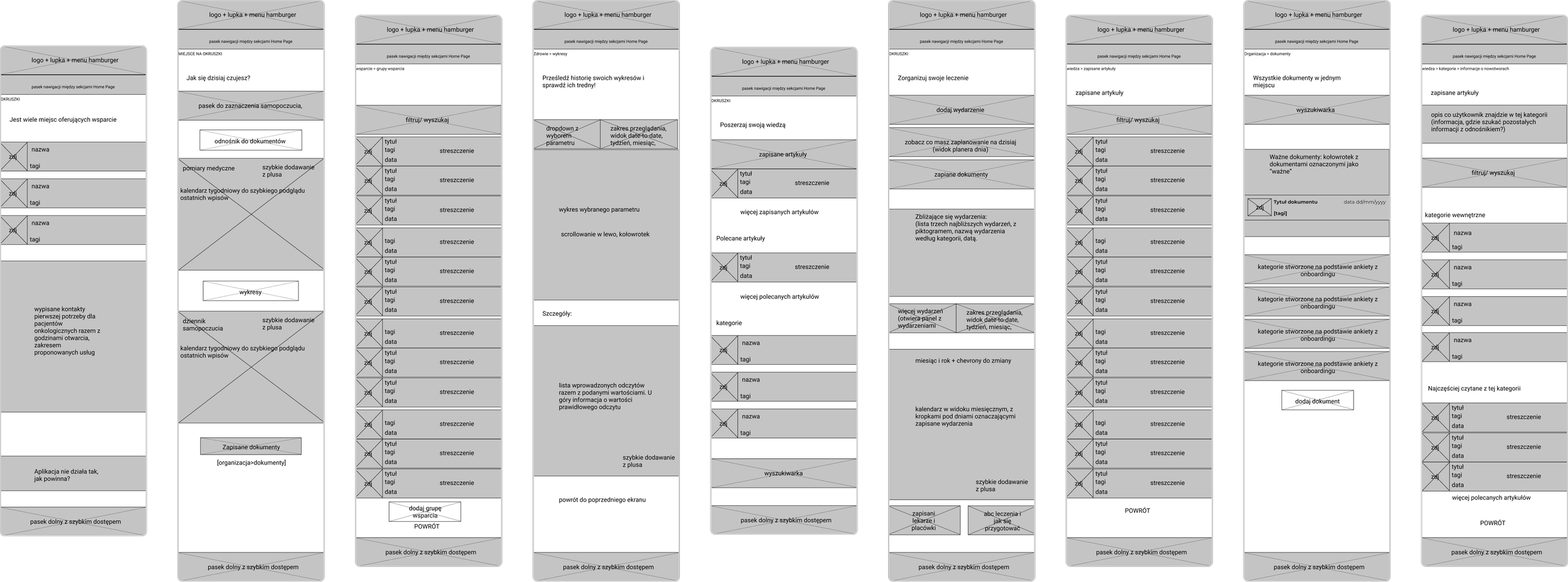
Health tab
This section includes medical and well-being journals, designed for easy access. Medical journals are placed at the top, with a summary of recent entries, a calendar for quick navigation, and a button for viewing history.
The well-being journal uses a scale to track emotions and side effects, with quick links to related resources at the bottom, such as the "ABCs of treatment."

Preview of mockups — Health Tab.
Organization tab
Focused on managing treatment, this section includes a calendar, event history, and document uploads. Upcoming events are displayed at the top, followed by saved documents and a monthly calendar view. Links to "recommended doctors" and "ABCs of treatment" are placed at the bottom for accessibility.

Preview of mockups — Organization tab.
Knowledge tab
This section organizes articles by topic with features like a search bar, saved bookmarks, and recommended articles. Categories further refine content with subcategories and highlighted pieces.
Article pages include details like authorship, reading time, and an index for easy navigation. Users can report outdated content to ensure information remains accurate.
Preview of mockups — Knowledge Tab.
Support tab
This section provides information about oncology foundations, support groups, and forums. A prototype was created featuring the Alivia foundation, emergency contact numbers, and a call function directly linked to the listed numbers for immediate assistance.
Preview of mockups — Support tab.
Summary
Conducting thorough research and creating detailed canvases paid off, as it clarified what to prioritize and avoid in later stages. This process was a valuable learning experience, allowing me to test research templates from school. While I made some mistakes along the way, it was a great opportunity to learn and refine my approach before working on a live project.
Lessons for me
Research is crucial and cannot be overlooked — it provides the foundation for understanding users' needs, expectations, and limitations. Without it, designs lack purpose. Validating ideas and taking time to step back, relax, and revisit challenges can lead to fresh perspectives and better outcomes.
First ideas are rarely the best; reevaluating sketches, colors, or concepts often yields stronger results. While UI isn't my strongest area, this project reflects my growth and learning. Though I see room for improvement now, as a first project, it served its purpose and laid a solid foundation for my development.
Future growth opportunities
All the proposed features require testing with a larger group of respondents to validate their practicality and effectiveness. While some ideas seem promising, they may not work as intended in real-world scenarios.
Additionally, certain features will need feedback from specific groups of users, which might only be accessible once the app reaches a broader audience within the cancer patient community.
Juvenile account
Develop a version tailored for adolescent patients with adjusted copywriting and engaging elements to encourage regular data entry. Consider incorporating a parental account for managing appointments and measurements.
Advanced Age Version
Adapt features for older adults, leveraging their increasing smartphone usage, with simplified navigation and accessibility.
Sponsorships
secure funding to cover the costs of implementation, maintenance, and ongoing development, ensuring the app remains free and accessible.
Forum
Implementing a forum requires moderators to maintain order and prevent misinformation, necessitating significant resources and possibly a sponsor.
Widget
introduce phone widgets for quick access to appointments, health entries, or documents.
Security button
add a widget-based emergency notification feature, particularly useful for terminal or elderly patients experiencing sudden health issues.
Check other case studies

The goal was to design a B2C platform enabling users to search for movies playing in nearby cinemas.

Showcase presenting the process of transitioning the cinema hall creator from an old desktop application to a web version.
Learn more about my experience, background and approach to design.
Let’s connect and explore the possibilities on how we can work together.