
Case study
Event subpage for IT company — IBC 2024
Time range
Jul 2024 – Sep 2024
Time for reading
~ 8 min
Tags
UX/UI, new project, desktop
This task was a part of a bigger project — preparation for the 2024 International Broadcast Convention (IBC) for createctrl. The primary goal was to inform customers about our participation in IBC and direct them to our booth. Additionally, we aimed to summarize our product offerings on this page, making it suitable for use in newsletters.
Context
IBC as event & the main project
This case study is closely linked to two others — the Presentation Kiosk App and Whitepapers. At IBC, CreateCtrl showcases its WebApp, a suite of 12 applications tailored for broadcast management.
The project scope
Development of a subpage for the main CreateCtrl website, highlighting our participation in the IBC event. The subpage includes a header with concise information, details about our offerings, a map directing visitors to our booth, and a calendar for scheduling meetings during IBC.
Timeline issues
We received all three tasks, along with several smaller ones, in mid-July, leaving us approximately two months to develop the entire subbrand. To meet the deadline, we worked on all projects simultaneously, prioritizing those requiring development time. Despite these constraints, all IBC-related projects were successfully delivered on time.
About the event & organization
Previous years & CreateCtrl on IBC
Each year, CreateCtrl participates in IBC to showcase updates to the WebSuite Apps and gain public recognition. In previous editions, the company prepared a booth and POV materials blending CreateCtrl and WebSuite design systems.
2024 IBC event
For the 2024 edition, the scope expanded significantly to include an exclusive design system, tablet presentation app, a dedicated website, newsletters, banners, and email footers.
Development team
3 PMs, 2 UI/UX designers, 1 frontend developer.
The outcome
Altough the very tight deadline, we were able to deliver the whole project on time. Also, COO’s announcement that all projects from the 2024 event, including the subpage, would be reused for future editions.
All materials, designs, and insights presented in this case study are the property of createctrl. This work is shared for portfolio purposes only, with the sole intent of demonstrating my role and contributions to the project. No unauthorized use, reproduction, or distribution is permitted.
Design process
Design process
Research
Our main reference was the IBC website, where we analyzed their data presentation and design style to ensure consistency, especially if we needed to use their materials. We also reviewed the websites of other IBC participants for inspiration and ideas.
The stakeholders had outlined the content to be showcased, giving us clear implementation goals:
IBC short description.
About us and WebApps.
The map leading to our booth.
Calendar to sign up for s meetup during the IBC.

Example of IBC materials, source: https://show.ibc.org/

Example of IBC materials, source: https://show.ibc.org/

Example of IBC materials, source: https://show.ibc.org/

Example of IBC materials, source: https://www.studiotech.pl/ibc2024

Example of IBC materials, source: https://vmgexpo.pl/oferta/ibc-2024/
Design change process
As in all project related to IBC, the timeline for creating this page was very tight, requiring us to begin work immediately to allow sufficient time for development. Luckily, we already had the main visuals selected, as well as the texts were given by the Product Manager.
Ideation
Initially, my colleague Paulina Krowińska and I divided the work equally. However, due to the extensive workload and tight deadline, we collaborated closely—holding daily meetings and frequent consultations to align progress and design decisions.
Since the page elements were already defined, our ideation process focused more on the design system and visual consistency. We worked simultaneously to ensure all related projects maintained a cohesive look and feel.
We aimed for a modern, lightweight look while incorporating CreateCtrl’s brand colors. To differentiate this sub-brand from the main one, we wanted to introduce a more creative approach, allowing for greater design flexibility.
Design assumptions
CreateCtrl projects typically avoid decorative elements, as the software (SaaS, CRM) is inherently information-dense. However, for this project, we wanted to break that pattern by incorporating geometric shapes to enhance the visuals and add a fresh, modern touch.
Decors
We needed to create visuals that either fits the IBC design style for 2024 event, or something that will connect those two.
IBC’s materials
We needed to align our design system with the IBC’s. Our goal was to emphasize our ongoing participation in the event, showcasing that we are not just a part of it not only this, but every year.
Wireframes
Since the main design system was already in place, our wireframes were more advanced than usual, as we had a clear vision of the final look. We also maintained the navigation from the main page.
At the top, we included a small hero image with a brief IBC description and a CTA button for scheduling meetings. This was followed by sections about the company and WebApps, a map directing visitors to our booth, and finally, a form for signing up for meetings during the event.

Wireframe of the page, the header & about the company and product.

Wireframe of the page, webapps feature and the map.

Wireframe of the page, calendar and footer from the global page.
Navigation to this page
Our first step was to determine how users would access this content. Since it was designed as a subpage of our main site, createctrl.com, we added a distinct menu item to highlight the seasonal event and attract visitor interest.
To further differentiate this menu category from the others, we used CreateCtrl’s brand orange for its color.

Preview of the navigation to created subpage, IBC 2024.
Style Guide
Typically, UX/UI design starts with colorless wireframes to focus on the structure and content. However, since the main design system was already established during the WebApps Tablet Presentation App, we combined the wireframes with mockups from the start, using predefined colors and styles to save time.
Following the style guide, Paulina Krowińska and I defined key design elements and styles for all IBC-related content. This made integrating them into the page design a seamless process.


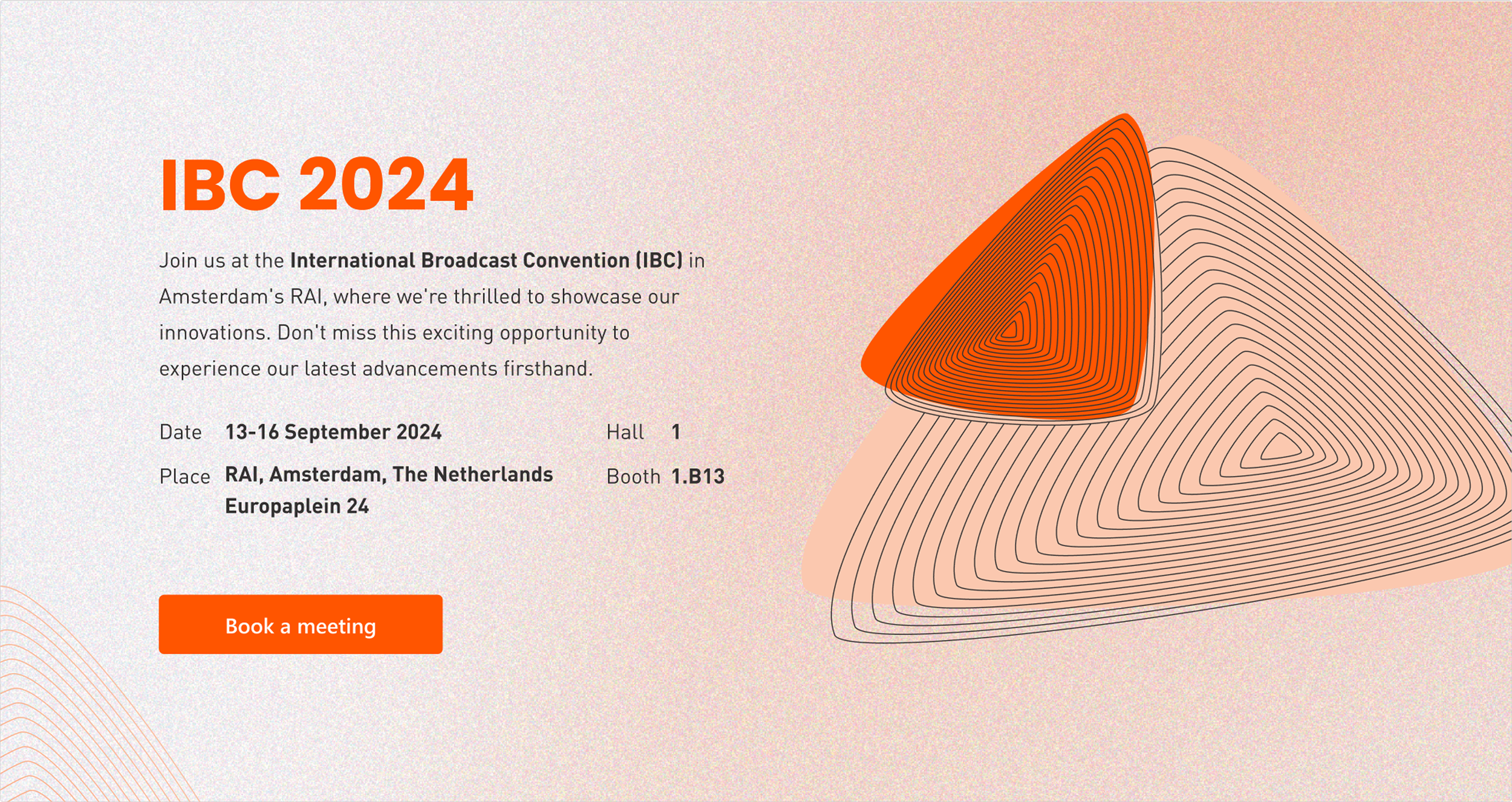
Hero Image
At the top of the page, we aimed to showcase our booth, but since the 2024 booth was newly designed by a third-party company, Mc-2, no photos were available, and their 3D renders didn’t suit the page’s aesthetic.
Initially, we placed a triangle collage, but at the COO's request, Paulina created an illustrated version of the booth, which was then incorporated into the design.
Hero image proposition, declined version.
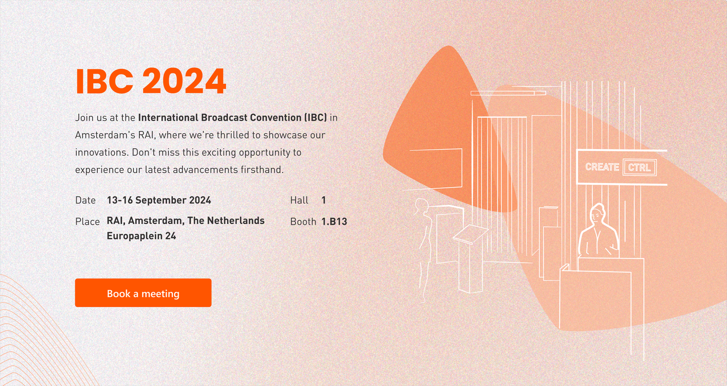
Hero image proposition, final version.
Images
The primary decorative elements were triangles, inspired by the 2024 IBC style guide, which prominently featured triangular motifs in its visuals. To maintain visual consistency with the event’s branding, we incorporated these geometric shapes throughout the design, adding a dynamic and modern feel.
For additional imagery, the Product Manager chose to use app screenshots and a collage of WebApp icons. I designed the collage to align with CreateCtrl’s aesthetic while ensuring clarity and engagement.

Preview of images that were selected.
Map
The biggest challenge was to design a map to clearly show our location at the IBC. The complexity of the building, with multiple levels and entrances, risked confusing visitors.
To simplify navigation, we included key landmarks like the nearby metro station and the river behind the venue. Additionally, we marked the entrances and added a zoomed-in view of the specific area where our booth was located.

Preview of the map leading to createctrl booth.
Schedule a meeting form
The final section of the subpage featured a form for scheduling meetings at the IBC. We used a pre-built component, focusing our efforts on customizing its GUI and making minor adjustments to align it with the overall design.

Preview of the form for scheduling a meeting; the default view.

Preview of the form for scheduling a meeting; the confirmation note.
Final product
The primary decorative elements were triangles, inspired by the 2024 IBC style guide, which featured triangular motifs in its visuals. For other images, the Product Manager opted to use app screenshots and a collage of WebApp icons, which I designed.
Summary
This project was straightforward to implement, as most of the design system was already in place. Although we didn’t conduct specific research to track page visits, the COO’s announcement during the IBC summary — that all projects from the 2024 event, including the subpage, would be reused for future editions — suggests it was a successful project.
We successfully delivered the project, even with short deadline.
Check other case studies

Development of a technical documentation and subpage for their storage.

Case study about creating a hobbyist gecko store, where I was given full creative freedom.
Learn more about my experience, background and approach to design.
Let’s connect and explore the possibilities on how we can work together.